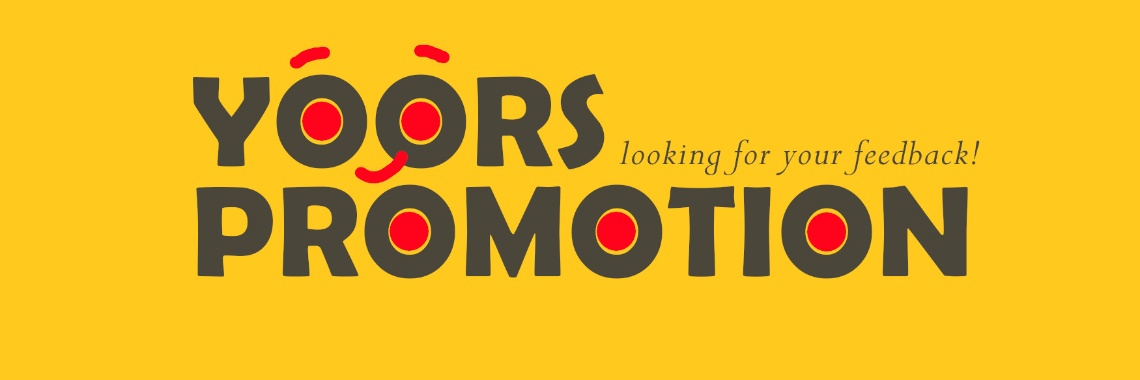
Help me improve these Yoors promotion images

[Edited on 20.01.2021 to add the link to the post containing the final version of the images. Thank you to everyone for all the kind words and great suggestions!]
Hi everyone!
I've been tinkering with GIMP again, and this time around I thought I'd spend some time trying to create images that I could use on my social media accounts to spread the word about Yoors.
The result is what you see below: three square images, each in its own style, highlighting some of the features of Yoors that we all know and love. I've made the images square so they can fit Instagram's special format, but I believe they'll also fit nicely on Facebook, Pinterest, a blog and wherever else one can share a picture with the world.
My plan is to make them available here on Yoors as well, in case any other Yoorsie wishes to use them.


But perseverance wins the day.


then €5.99/month after 14 days
Start your 14-day free trial now to publish your sponsored content. Cancel anytime.